1. Preparing our dataset
These recommendations are so on point! How does this playlist know me so well?

Over the past few years, streaming services with huge catalogs have become the primary means through which most people listen to their favorite music. But at the same time, the sheer amount of music on offer can mean users might be a bit overwhelmed when trying to look for newer music that suits their tastes.
For this reason, streaming services have looked into means of categorizing music to allow for personalized recommendations. One method involves direct analysis of the raw audio information in a given song, scoring the raw data on a variety of metrics. Today, we'll be examining data compiled by a research group known as The Echo Nest. Our goal is to look through this dataset and classify songs as being either 'Hip-Hop' or 'Rock' - all without listening to a single one ourselves. In doing so, we will learn how to clean our data, do some exploratory data visualization, and use feature reduction towards the goal of feeding our data through some simple machine learning algorithms, such as decision trees and logistic regression.
To begin with, let's load the metadata about our tracks alongside the track metrics compiled by The Echo Nest. A song is about more than its title, artist, and number of listens. We have another dataset that has musical features of each track such as danceability and acousticness on a scale from -1 to 1. These exist in two different files, which are in different formats - CSV and JSON. While CSV is a popular file format for denoting tabular data, JSON is another common file format in which databases often return the results of a given query.
Let's start by creating two pandas DataFrames out of these files that we can merge so we have features and labels (often also referred to as X and y) for the classification later on.
import pandas as pd
# Read in track metadata with genre labels
tracks = pd.read_csv('datasets/fma-rock-vs-hiphop.csv')
# Read in track metrics with the features
echonest_metrics = pd.read_json('datasets/echonest-metrics.json', precise_float=True)
# Merge the relevant columns of tracks and echonest_metrics
echo_tracks = echonest_metrics.merge(tracks[['track_id','genre_top']], on='track_id')
# Inspect the resultant dataframe
echo_tracks.info()2. Pairwise relationships between continuous variables
We typically want to avoid using variables that have strong correlations with each other -- hence avoiding feature redundancy -- for a few reasons:
- To keep the model simple and improve interpretability (with many features, we run the risk of overfitting).
- When our datasets are very large, using fewer features can drastically speed up our computation time.
To get a sense of whether there are any strongly correlated features in our data, we will use built-in functions in the pandas package.
# Create a correlation matrix
corr_metrics = echo_tracks.corr()
corr_metrics.style.background_gradient()3. Splitting our data
As mentioned earlier, it can be particularly useful to simplify our models and use as few features as necessary to achieve the best result. Since we didn't find any particularly strong correlations between our features, we can now split our data into an array containing our features, and another containing the labels - the genre of the track.
Once we have split the data into these arrays, we will perform some preprocessing steps to optimize our model development.
# Import train_test_split function and Decision tree classifier
from sklearn.model_selection import train_test_split

# Create features
features = echo_tracks.drop(["genre_top", "track_id"], axis=1).values

# Create labels
labels = echo_tracks['genre_top'].values

# Split our data
train_features, test_features, train_labels, test_labels = train_test_split(features, labels, random_state=10)4. Normalizing the feature data
As mentioned earlier, it can be particularly useful to simplify our models and use as few features as necessary to achieve the best result. Since we didn't find any particular strong correlations between our features, we can instead use a common approach to reduce the number of features called principal component analysis (PCA).
It is possible that the variance between genres can be explained by just a few features in the dataset. PCA rotates the data along the axis of highest variance, thus allowing us to determine the relative contribution of each feature of our data towards the variance between classes.
However, since PCA uses the absolute variance of a feature to rotate the data, a feature with a broader range of values will overpower and bias the algorithm relative to the other features. To avoid this, we must first normalize our train and test features. There are a few methods to do this, but a common way is through standardization, such that all features have a mean = 0 and standard deviation = 1 (the resultant is a z-score).
# Import the StandardScaler
from sklearn.preprocessing import StandardScaler

# Scale the features and set the values to a new variable
scaler = StandardScaler()

# Scale train_features and test_features
scaled_train_features = scaler.fit_transform(train_features, train_labels)
scaled_test_features = scaler.transform(test_features)5. Principal Component Analysis on our scaled data
Now that we have preprocessed our data, we are ready to use PCA to determine by how much we can reduce the dimensionality of our data. We can use scree-plots and cumulative explained ratio plots to find the number of components to use in further analyses.
Scree-plots display the number of components against the variance explained by each component, sorted in descending order of variance. Scree-plots help us get a better sense of which components explain a sufficient amount of variance in our data. When using scree plots, an 'elbow' (a steep drop from one data point to the next) in the plot is typically used to decide on an appropriate cutoff.
# This is just to make plots appear in the notebook
%matplotlib inline

# Import our plotting module, and PCA class
#... YOUR CODE ...
import matplotlib.pyplot as plt
from sklearn.decomposition import PCA

# Get our explained variance ratios from PCA using all features
pca = PCA()
pca.fit(scaled_train_features)
exp_variance = pca.explained_variance_ratio_

# plot the explained variance using a barplot
fig, ax = plt.subplots()
ax.bar(range(pca.n_components_), exp_variance)
ax.set_xlabel('Principal Component #')6. Further visualization of PCA
Unfortunately, there does not appear to be a clear elbow in this scree plot, which means it is not straightforward to find the number of intrinsic dimensions using this method.
But all is not lost! Instead, we can also look at the cumulative explained variance plot to determine how many features are required to explain, say, about 85% of the variance (cutoffs are somewhat arbitrary here, and usually decided upon by 'rules of thumb'). Once we determine the appropriate number of components, we can perform PCA with that many components, ideally reducing the dimensionality of our data.
# Import numpy
import numpy as np

# Calculate the cumulative explained variance
cum_exp_variance = np.cumsum(exp_variance)

# Plot the cumulative explained variance and draw a dashed line at 0.85.
fig, ax = plt.subplots()
ax.plot(cum_exp_variance)
ax.axhline(y=0.85, linestyle='--')7. Projecting on to our features
We saw from the plot that 6 features (remember indexing starts at 0) can explain 85% of the variance!
Therefore, we can use 6 components to perform PCA and reduce the dimensionality of our train and test features.
# Perform PCA with the chosen number of components and project data onto components
pca = PCA(n_components=6, random_state=10)

# Fit and transform the scaled training features using pca
train_pca = pca.fit_transform(scaled_train_features)

# Fit and transform the scaled test features using pca
test_pca = pca.transform(scaled_test_features)8. Train a decision tree to classify genre
Now we can use the lower dimensional PCA projection of the data to classify songs into genres.
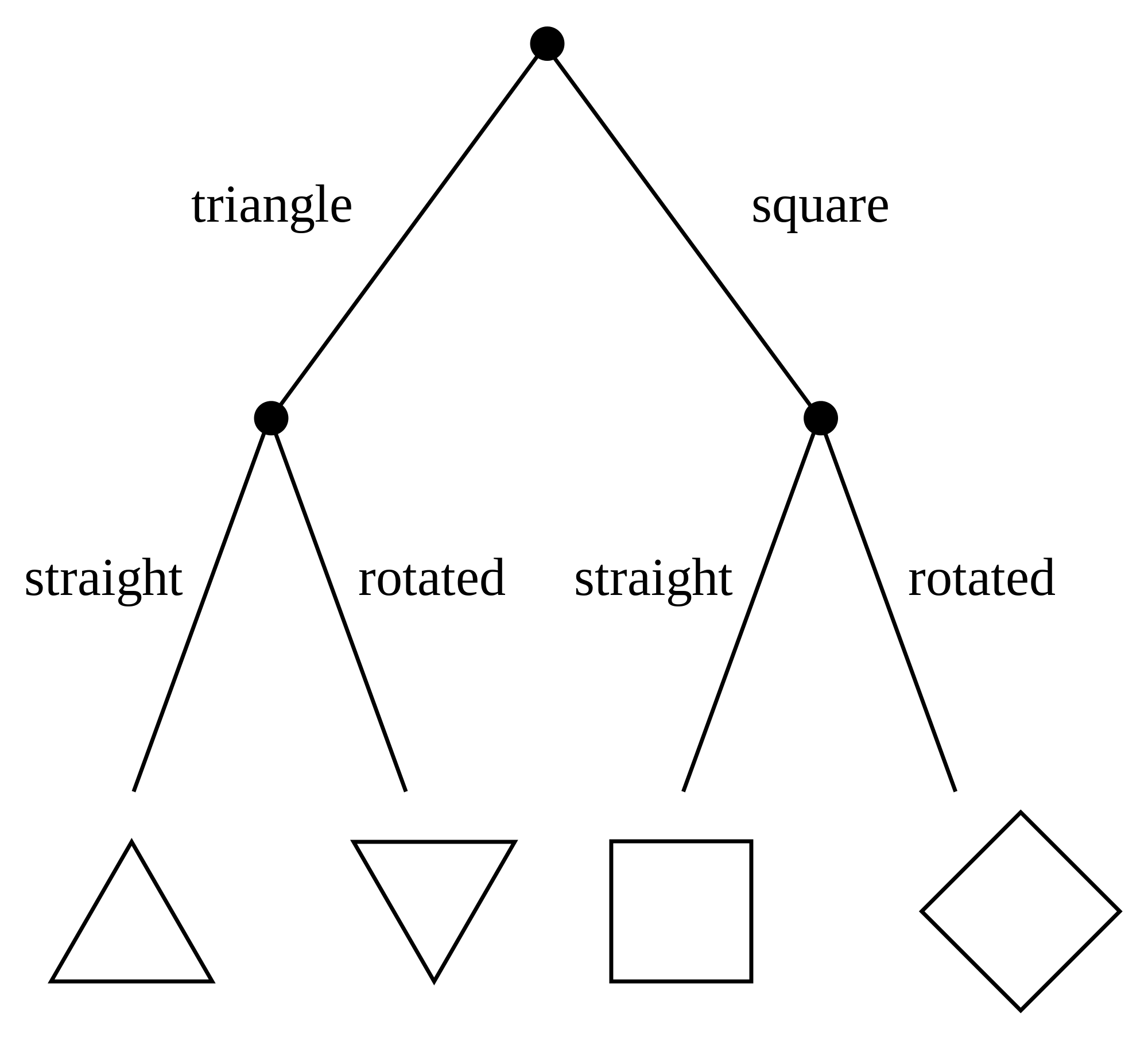
Here, we will be using a simple algorithm known as a decision tree. Decision trees are rule-based classifiers that take in features and follow a 'tree structure' of binary decisions to ultimately classify a data point into one of two or more categories. In addition to being easy to both use and interpret, decision trees allow us to visualize the 'logic flowchart' that the model generates from the training data.
Here is an example of a decision tree that demonstrates the process by which an input image (in this case, of a shape) might be classified based on the number of sides it has and whether it is rotated.