1. Bitcoin and Cryptocurrencies: Full dataset, filtering, and reproducibility
Since the launch of Bitcoin in 2008, hundreds of similar projects based on the blockchain technology have emerged. We call these cryptocurrencies (also coins or cryptos in the Internet slang). Some are extremely valuable nowadays, and others may have the potential to become extremely valuable in the future1. In fact, on the 6th of December of 2017, Bitcoin has a market capitalization above $200 billion.
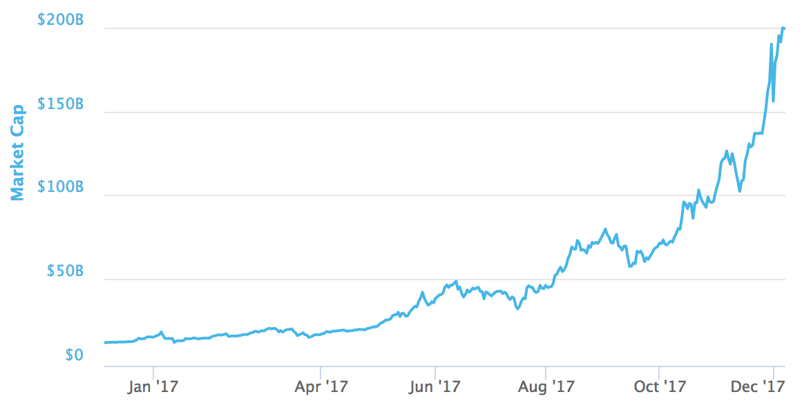
The astonishing increase of Bitcoin market capitalization in 2017.
*1 WARNING: The cryptocurrency market is exceptionally volatile2 and any money you put in might disappear into thin air. Cryptocurrencies mentioned here might be scams similar to Ponzi Schemes or have many other issues (overvaluation, technical, etc.). Please do not mistake this for investment advice. *
2 Update on March 2020: Well, it turned out to be volatile indeed :D
That said, let's get to business. We will start with a CSV we conveniently downloaded on the 6th of December of 2017 using the coinmarketcap API (NOTE: The public API went private in 2020 and is no longer available) named datasets/coinmarketcap_06122017.csv.
# Importing pandas
import pandas as pd
# Importing matplotlib and setting aesthetics for plotting later.
import matplotlib.pyplot as plt
%matplotlib inline
%config InlineBackend.figure_format = 'svg'
plt.style.use('fivethirtyeight')
# Reading datasets/coinmarketcap_06122017.csv into pandas
dec6 = pd.read_csv("datasets/coinmarketcap_06122017.csv")
# Selecting the 'id' and the 'market_cap_usd' columns
market_cap_raw = dec6[['id','market_cap_usd']]
# Counting the number of values
print(market_cap_raw['market_cap_usd'].count())2. Discard the cryptocurrencies without a market capitalization
Why do the count() for id and market_cap_usd differ above? It is because some cryptocurrencies listed in coinmarketcap.com have no known market capitalization, this is represented by NaN in the data, and NaNs are not counted by count(). These cryptocurrencies are of little interest to us in this analysis, so they are safe to remove.
# Filtering out rows without a market capitalization
cap = market_cap_raw.query("market_cap_usd.notnull()")

# Counting the number of values again
print(cap["market_cap_usd"].count())3. How big is Bitcoin compared with the rest of the cryptocurrencies?
At the time of writing, Bitcoin is under serious competition from other projects, but it is still dominant in market capitalization. Let's plot the market capitalization for the top 10 coins as a barplot to better visualize this.
# Declaring these now for later use in the plots
TOP_CAP_TITLE = 'Top 10 market capitalization'
TOP_CAP_YLABEL = '% of total cap'

# Selecting the first 10 rows and setting the index
cap10 = cap.head(10).set_index('id')

# Calculating market_cap_perc
cap10 = cap10.assign(market_cap_perc=lambda x: round((x.market_cap_usd / cap['market_cap_usd'].sum())*100,2))

# Plotting the barplot with the title defined above
ax= cap10.plot.bar('market_cap_perc', title=TOP_CAP_TITLE)

# Annotating the y axis with the label defined above
ax.set_ylabel(TOP_CAP_YLABEL)4. Making the plot easier to read and more informative
While the plot above is informative enough, it can be improved. Bitcoin is too big, and the other coins are hard to distinguish because of this. Instead of the percentage, let's use a log10 scale of the "raw" capitalization. Plus, let's use color to group similar coins and make the plot more informative1.
For the colors rationale: bitcoin-cash and bitcoin-gold are forks of the bitcoin blockchain2. Ethereum and Cardano both offer Turing Complete smart contracts. Iota and Ripple are not minable. Dash, Litecoin, and Monero get their own color.
1 This coloring is a simplification. There are more differences and similarities that are not being represented here.
2 The bitcoin forks are actually very different, but it is out of scope to talk about them here. Please see the warning above and do your own research.
# Colors for the bar plot
COLORS = ['orange', 'green', 'orange', 'cyan', 'cyan', 'blue', 'silver', 'orange', 'red', 'green']
print(cap10)
# Plotting market_cap_usd as before but adding the colors and scaling the y-axis
ax = cap10.plot.bar('market_cap_perc', title=TOP_CAP_TITLE, color=COLORS, logy=True)

# Annotating the y axis with 'USD'
ax.set_ylabel('USD')

# Final touch! Removing the xlabel as it is not very informative
ax.set_xlabel('')5. What is going on?! Volatility in cryptocurrencies
The cryptocurrencies market has been spectacularly volatile since the first exchange opened. This notebook didn't start with a big, bold warning for nothing. Let's explore this volatility a bit more! We will begin by selecting and plotting the 24 hours and 7 days percentage change, which we already have available.
# Selecting the id, percent_change_24h and percent_change_7d columns
volatility = dec6[['id', 'percent_change_24h', 'percent_change_7d']]

# Setting the index to 'id' and dropping all NaN rows
volatility = volatility.set_index('id').dropna()

# Sorting the DataFrame by percent_change_24h in ascending order
volatility = volatility.sort_values(by=['percent_change_24h'], ascending = True)

# Checking the first few rows
print(volatility.head())6. Well, we can already see that things are a bit crazy
It seems you can lose a lot of money quickly on cryptocurrencies. Let's plot the top 10 biggest gainers and top 10 losers in market capitalization.
print(volatility.percent_change_24h)#Defining a function with 2 parameters, the series to plot and the title
def top10_subplot(volatility_series, title):
# Making the subplot and the figure for two side by side plots
fig, axes = plt.subplots(nrows=1, ncols=2, figsize=(10, 6))
# Plotting with pandas the barchart for the top 10 losers
ax = volatility_series[:10].plot.bar(ax=axes[0], color='darkred')
# Setting the figure's main title to the text passed as parameter
fig.suptitle(title)
# Setting the ylabel to '% change'
ax.set_ylabel('% change')
# Same as above, but for the top 10 winners
ax = volatility_series[-10:].plot.bar(ax=axes[1], color= 'darkblue')
# Returning this for good practice, might use later
return fig, ax
DTITLE = "24 hours top losers and winners"
# Calling the function above with the 24 hours period series and title DTITLE
fig, ax = top10_subplot(volatility.percent_change_24h, DTITLE)7. Ok, those are... interesting. Let's check the weekly Series too.
800% daily increase?! Why are we doing this tutorial and not buying random coins?1
After calming down, let's reuse the function defined above to see what is going weekly instead of daily.
1 Please take a moment to understand the implications of the red plots on how much value some cryptocurrencies lose in such short periods of time